Back To Basics Series
CSS #1
Web page structure

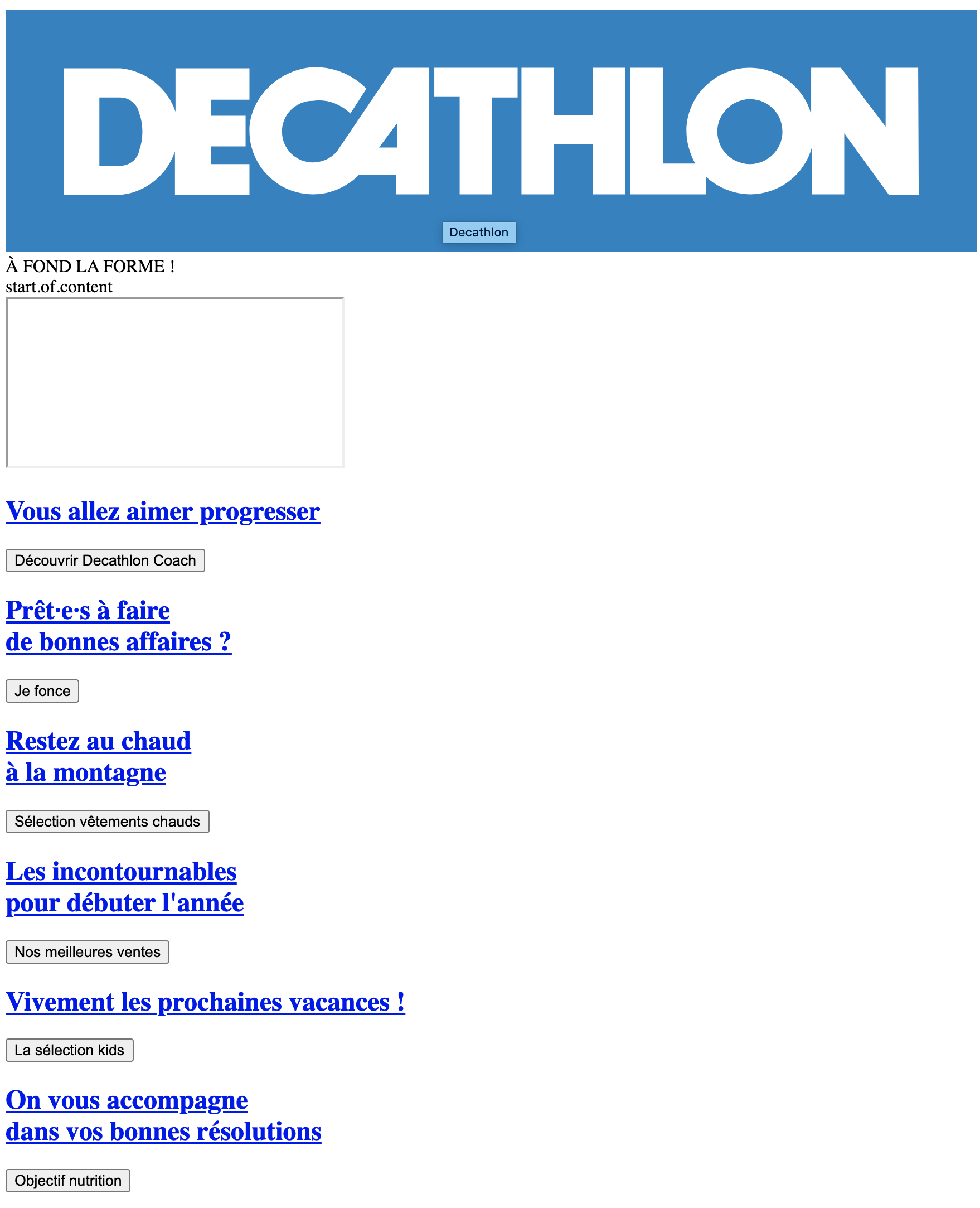
Example Decathlon.fr without CSS
Web page structure

Example Decathlon.fr with CSS
The CSS Story
At the beginning of the web, css didn't exist.
HTML was born in 1991, and CSS in 1996.
At this time,
available styles were really limited.
It was possible to use dedicated tags styles, through, like :
<font color="#aab1c3">text</font>Allowing to define text color.
The CSS Story
As people wanted to have more complex displays, the web
became a mix between styles and contents making it
really difficult to understand.
This is when CSS was created to split styles and contents and make it clean.
Cascading and inheritance
As the name says (Cascading Style Sheet),
a CSS is a sheet listing style rules
applied in cascade to HTML elements.
It means that some styles are directly applied to an element and others
are applied to children by inheritance.
It is specially relevant for font sizes, text colors, line height ...
Cascading and inheritance
The main benefit is that we don't have to apply style rules
to every element, you only have to apply generic styles
on the top elements of the HTML structure
This is why we define generic styles on top elements like
<html> and/or <body>
Cascading and inheritance
Then every styles of an element can be overridden or completed by more specific ones breaking inheritance.
Browsers compatibility
CSS evolution is ruled by W3C (international consortium)
(W3C for World Wide Web Consortium),
where every rule and CSS version
is made official
CSS is currently in version 3, released in 2005.
Browsers compatibility
When a feature is not official,
it stays as a draft for a while,
but can be used and adopted
in many different ways by browsers
(prefixes, special displays and behaviours, ...).
It is only when it is mature and used enough
that it is made official.
Browsers compatibility
For example, Grid Layout
was only made official after many years
of discussions and various validations.
During this time it evolved and was used
by some developers who couldn't wait
helping the feature to be better but
costing many updates
Browsers compatibility
As CSS is constantly evolving
it is important to know which rules to use
depending on browers compatibility
If you need to check browser compatibilty
visit www.caniuse.com
Anatomy of a CSS rule
A CSS rule is composed of a selector,
used for targeting one or many elements
on which you want to apply styles
            selector {

            }
Anatomy of a CSS rule
...containing one or multiple declarations ...
            selector {
              declaration;
            }
Anatomy of a CSS rule
Declarations themselves are composed of a a property/value couple
            selector {
              property: value;
            }
Which gives us :
              p {
                color: red;
              }
Some examples
            body {
              font-size: 16px;
              font-family: "Times", serif;
            }
Some examples
            body {
              font-size: 16px;
              font-family: "Times", serif;
            }

            .main-section {
              position: relative;
              padding: 1rem 0;
              border-top: 1px solid #ccc;
            }
Some examples
            body {
              font-size: 16px;
              font-family: "Times", serif;
            }

            .main-section {
              position: relative;
              padding: 1rem 0;
              border-top: 1px solid #ccc;
            }

            .main-section > p {
              /* external margin of 16px top and bottom, and center horizontally */
              margin: 1rem auto;
              width: 600px;
              font-style: italic;
              font-size: 1.25rem; /* 20px */
            }
/* only first letter of every paragraph in main-section */
.main-section > p::first-letter {
text-transform: uppercase;
font-size: 3em; /* 3 x 20px = 60px */
}
Units and values
Some properties expect values with
absolute or relative units.
Absolute units
The most famous : px (pixels).
As its name suggests,
this unit allow us to apply fixed values in pixels.
For accessibility and responsive reasons,
this unit must be used with caution,
and often replaced by others, more responsive .
Relative units
% : percentage
As obvious as it seems,
you always need to know on what it is based
and on what property you should apply it.
Relative units
vw and vh
For viewport width and viewport height.
1 unit is 1% of the viewport
(visible area of the web page).
Relative units
em
For the (font-size)
applied to a parent,
or element itself (as seen previously in cascading).
Ex : for an element that has a 12px font-size ,
a child element with a 2em font-size will be 24px.
Relative units
rem (root em)
It is the font-size of the “root” element,
usually applied on <html> or <body>.
Ex : if a web page has global font-size of 16px,
a child element with font-size of 2.5rem will be 40px.
Other units
There are many more, some are a bit exotic, like :
ex, ch, lh, vmin, vmax,
or even pt (point) and cm, for printing purposes
Short-hand properties
Some properties
such as font, padding, margin, background,
can be shortened
Short-hand properties
For example : To add margin to an element, the following...
            .element {
              margin-top: 1rem;
              margin-right: 0;
              margin-bottom: 1rem;
              margin-left: 0;
            }
Short-hand properties
...can be shortened like this :
            .element {
              /* following the clock rule top > right > bottom > left */
              margin: 1rem 0 1rem 0;
            }
Short-hand properties
Or also :
            .element {
              /* top > right/left > bottom */
              margin: 1rem 0 1rem;
            }
Short-hand properties
Or also :
            .element {
              /* top/bottom > right/left */
              margin: 1rem 0;
            }
Short-hand properties
Or even, for a global margin :
            .element {
              margin: 1rem;
            }
Short-hand properties
An other example with property font
            {
              font-style: italic;
              font-weight: bold;
              font-size: 1.2em;
              line-height: 1.5;
              font-family: Arial, sans-serif;
            }
Short-hand properties
can be shortened like this :
            {
              font: italic bold 1.2em/1.5 Arial, sans-serif;
            }
Short-hand properties

margin/padding

border-radius
CSS Selectors
All of this is very nice but would be totally useless
if we did not have the selectors, allowing us to target elements which will receive the styles.
CSS Selectors
Universal Selector
Target every HTML elements
            * {
              color: black;
            }
CSS Selectors
Selector of HTML tag
Target every HTML elements of type <p>
            p {
              color: black;
            }
CSS Selectors
Selectors of class
Target every HTML elements
that has the matching CSS class :
            .my-class {
              color: black;
            }
CSS Selectors
Selector of ID
Target the (must-be) unique element with a matching attribute id
Difference between id and class attribute: The only difference between them is that “id” is unique in a page and can only apply to at most one element, while “class” selector can apply to multiple elements.
            #id-unique {
              color: black;
            }
CSS Selectors
Selector of attributes
Target elements with attributes that have
a specific value :
            a[target="_blank"] {
              color: black;
            }
CSS Selectors
Selector of attributes
Other example that targets elements with specified attribute,
even if it does not have a defined value
            div[style] {
              color: black;
            }
Complex CSS selectors
Combined selector
Target elements with all indicated classes
            .my-class-1.my-class-2 {
              color: black;
            }
Complex CSS selectors
Multiple selector
Target elements that match one of the selector
            .my-class-1, .my-class-2, quote, a[target="_blank"] {
              color: black;
            }
Complex CSS selectors
Descendence selector
Target specific children
            section p {
              color: black;
            }
Complex CSS selectors
Selector of direct child
Target direct children elements of specific type
            section > p {
              color: black;
            }
Complex CSS selectors
Selector of direct adjacency
Target elements directly following other elements
            // every paragraph following another one
            p + p {
              color: black;
            }
Complex CSS selectors
Selector of indirect adjacency
Target elements indirectly following other elements
            // every paragraph following indirectly another one
            p ~ p {
              color: black;
            }
Complex CSS selectors
There are many more,
and it's also possible to combine them.
Pseudo classes
A pseudo class is a key word that can be added to a selector to define a specific state
that elements must have to be targeted
They are defined with “:” (colon).
Examples :
              a:hover {}
              a:active {}
              a:focus {}
              a:visited {}
              ...
Pseudo elements
A pseudo-element is a key word that can be added to a selector to define a display of specific parts of an element.
They are defined with “::” (double colon).
Examples :
              a::after {}
              a::before {}
              input::placeholder {}
              ...
Good to know, pseudo elements can also be used with “:” because a few years ago, they were not considered different than pseudo classes
Pseudo elements
Some quotes
, he says, are better than none
Pseudo elements
Some quotes
, he says, are better than none
            q::before {
              content: "«";
              color: blue;
            }
            q::after {
              content: "»";
              color: red;
            }
Pseudo elements
Some quotes
, he says, are better than none
            q::before {
              content: "«";
              color: blue;
            }
            q::after {
              content: "»";
              color: red;
            }
Some quotes, he says,
are better than none
Selector priorities
Previous note :
Styles applied directly on HTML tags
through style attribute always have priority over CSS.
After we say this : selectors do have priorities.
Selector priorities
At equal priority of selector,
a CSS statement will overrule another one declared before :
              p { color: blue; }
              p { color: red; }
              // red will overrule blue
Selector priorities
But there is a priority rule calculated
upon the nature of the selector and what it combines :
- Level 1 : selector of type and pseudo-element
(p, div, ::before, etc) - Level 2 : selector of class (
.my-class) - Level 3 : selector of ID (
#my-id)
Selector priorities
For example, for a paragraph
...
Blue will keep priority over red :
                .paragraph { color: blue; }
                p { color: red; }
Selector priorities
Note: careful with overbidding selectors!
Avoid as much as possible selectors
too long or too complex/specific :
main#main-section div.scrollable > div > h2 > ul > li + li { ... }
and use selectors as generic as possible
that you can overrule more easily.
Exception handling with !important
In last resort, it is possible to add
!important to the declaration's value:
p { color: red !important; }
That will take absolute priority
on any selector specification.
Exception handling with !important
It also takes priority on styles directly applied to an HTML element.
In the following example, red will be applied.
...
p {color: red !important;}
Exception handling with !important
If two declarations with !important are in conflict,
priority will be applied in the same manner as any equally specific declarations.
It means that at equal selector weight,
it's the order that will prevail (the last one wins !) :
              p {color: blue !important;}
              p {color: red !important;}
Otherwise, the most specific selector takes the lead :
              p.blue {color: blue !important;}
              p {color: red !important;}
Exception handling with !important
Considered as a bad practice
or at least a last resort solution,
it can be useful in one use case :
If styles are applied directly to HTML tags, with Javascript,
and no CSS specification is enough.
Display
The attribute display, applied by default
according to the nature of the element can be updated
Most common values are :
-
inline:
applied to “inline” elements, such as tags to format text (strong,em,span, etc) -
block:
applied by default on elements like paragraph (p), generic boxes (div), or lists (ul,li), etc -
inline-block:
applied by default on tags likeimg,input,button
Display
There are many more values
Most of the time, they are linked to elements types
like table, table-cell, list-item, etc.
Since the release of flexbox, a,d grid layout,
(explained in CSS#2)
this list grew with some values like :
flex, inline-flex, grid, inline-grid, etc...
Native styles of browsers
To have a basic render of a web page
when no CSS is applied, browsers apply
basic styles.
Based upon the nature of an element
(<p>, <a>, <ul>, <strong>, ...),
a specific display can be applied
(block, inline, among others),
and also basic colors, borders, backgrounds, underlines, ...
Native styles of browsers

Example Decathlon.fr without CSS
Native styles of browsers
To get rid of these default native styles, there is the appearance property, deleting these styles
You can use it but keep in mind that it was not
made official yet and compatibility is not always right
Caniuse
Positions
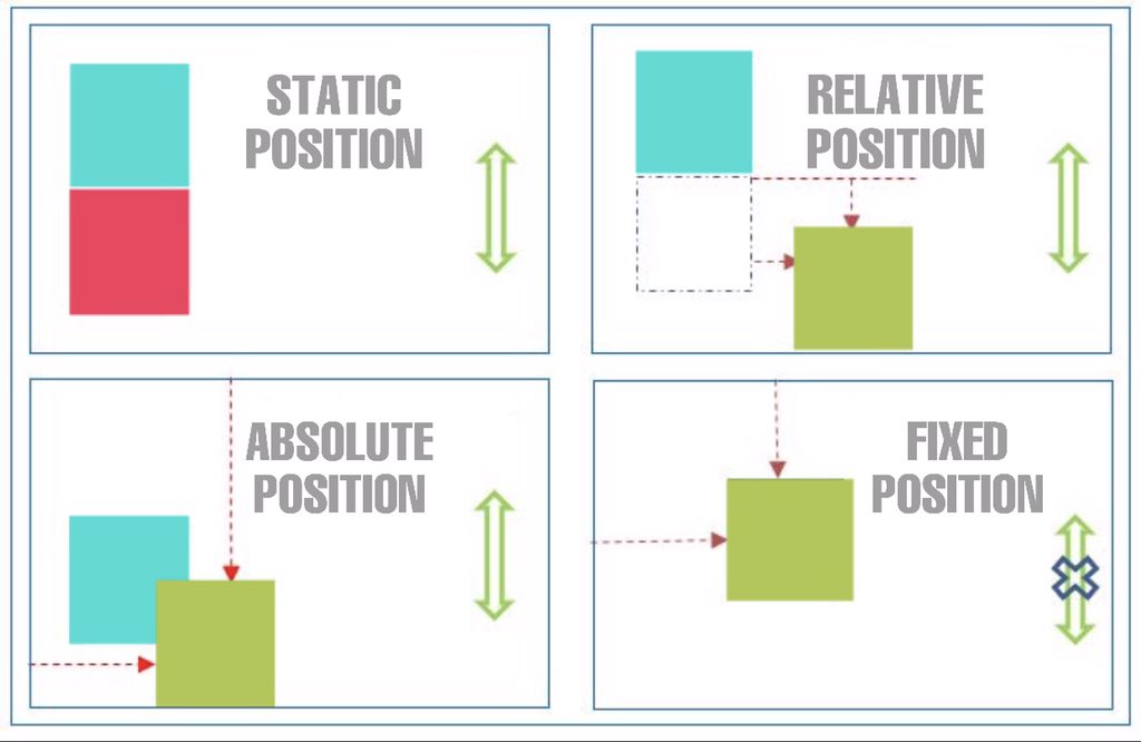
By default, any element is in “static” position :
position: static.
An element become “positioned” as soon as the property
position is specified (by a value different than static).
As soon as it is positioned, it is possible to move the element by moving properties :
left, top, right, and bottom.
Positions
Explanations of position values
relative:
element is positioned relatively comparing to its initial position. It appears moved on the screen, but it doesn't impact on other elements next to him.
Its initial position will leave an empty spot if you move it.
Positions
Explanations of position values
absolute:
Unlike it may seems, absolute value allows us to position an element relatively to his closest parent positioned.
If no parent element is positioned, positioning will be based on the document.
Element stays dependant to scroll
Positions
Explanations of position values
fixed:
An element infixedposition will be fixed regarding the viewport (visible part of the screen), it is not dependant to scroll whether it has positioned parents or not.
Positions
Explanations of position values
sticky:
The most recent so less compatible one (Caniuse), positionstickymakes an element depending on scroll, giving the impression that the element "follows the user" :
The element follows scroll as a static element, but become fixed when it reaches the limit of the viewport.
Positions
Note : positioning can be source of overlaps.
The z-index property allows to handle
levels of overlap for each element,
to makes them go "higher" or "lower"
A higher value will make an element go up.
If two elements with no z-index or same level are overlapping, it is the last one in the document that will appear on top.
Positions

